2024 Holiday Gift Guide
'Tis the season to be jolly—unless you're an architecture student. This time of year means pin-ups, all-nighters, and endless deadlines. They’re juggling plotter bookings and might not have seen daylight since Halloween.
If you have an architecture student or professional in your life, you just want to see them happy and, ideally, well-rested. So, we’ve crafted this visual gift guide just for them—an insider’s list of thoughtful gifts for the busy, creative minds you care about.
Here are 25 of our favorite gift ideas for 2024:
Disclaimer: all products featured were independently selected by our team and are not sponsored or promotional. However, if you purchase something through our links, we may earn an affiliate commission.
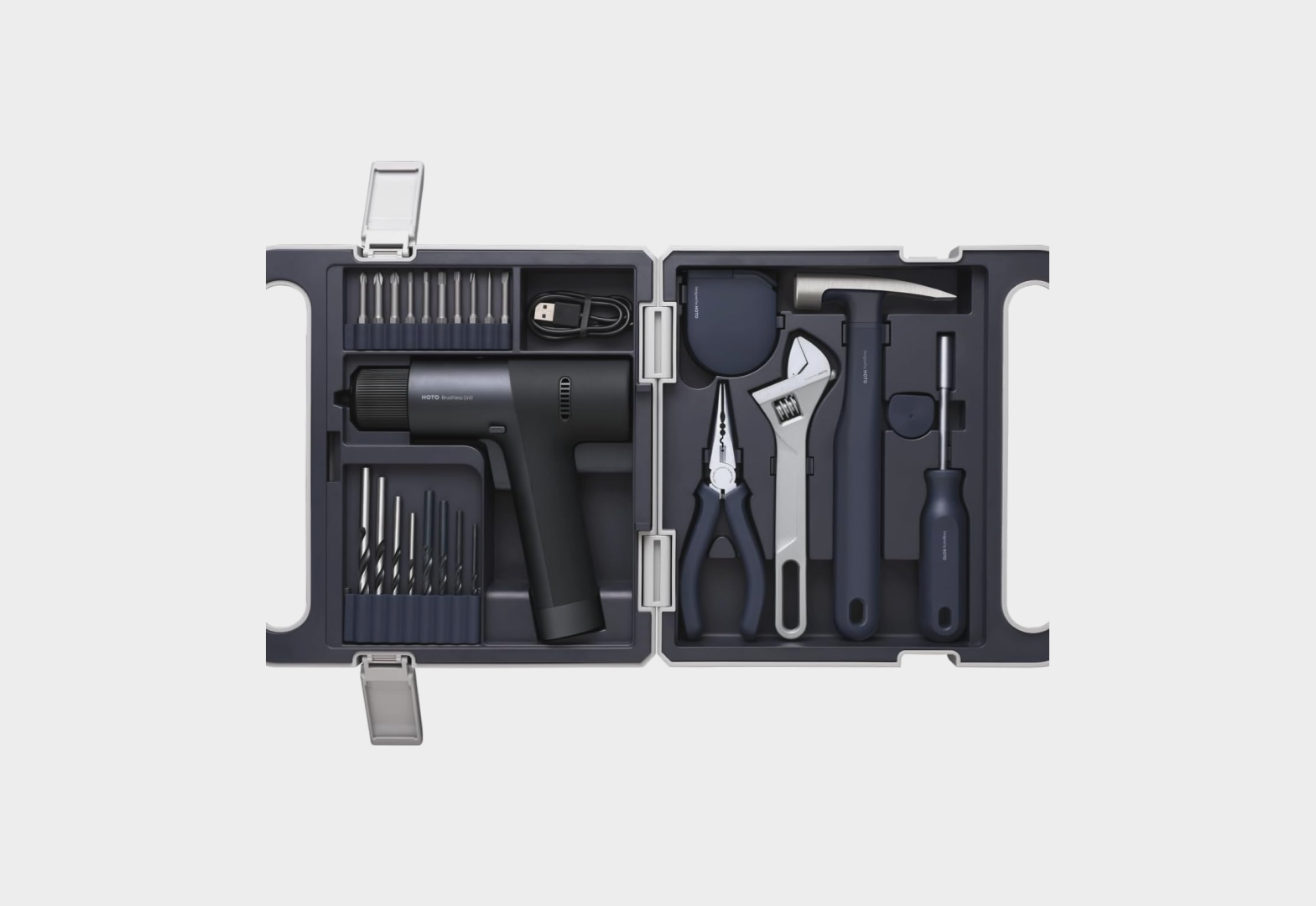
Perfect for those client meetings where you’re nodding politely about budget constraints, but your ankles are busy screaming about that cordless drill obsession in your garage.
Nothing says 'I'm a sophisticated design professional' quite like announcing your power tool passion from ankle level.
Warning: May result in sudden, unplanned pilgrimages to Home Depot.
Because your to-do list deserves the same ghostly, layered complexity as that “vision” you still haven’t quite finished.
It shouldn’t just exist—it should haunt you.
When you want your daily reminders to feel like faded whispers from a past life.
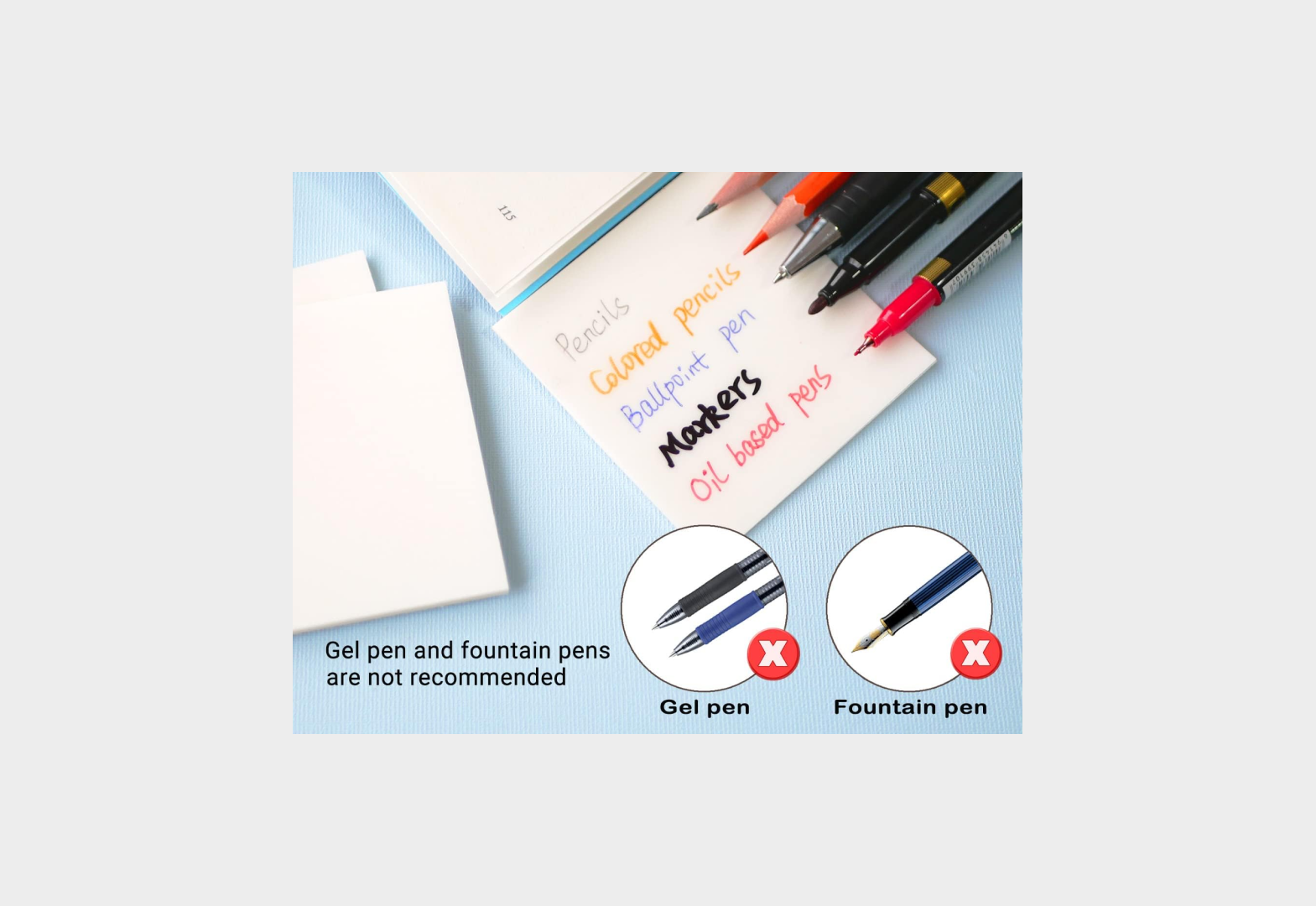
Perfect for scribbling ideas that’ll be about as readable as your handwriting at 3 a.m., but now…in sticky note form.
Stack them endlessly to create a palimpsest of procrastination that looks intentionally artistic.
Because sometimes the only one who truly understands your design concept is a tiny yellow plastic bird who never questions your cantilevers.
When your studio critics are being particularly brutal, this little guy's unchanging expression of mild encouragement might be exactly what you need.
Bonus: It floats, unlike your last model when your professor accidentally spilled their coffee on it.
Behold! The accessory that says 'I'm a serious design professional' but also 'I lose everything that isn't physically tethered to my body.'
Perfect for those marathon pin-up sessions when your glasses need to hang dramatically around your neck while you squint at presentations pretending to see the subtle nuances in yet another chipboard model.
Made from stainless steel mesh because apparently even your eyewear retention system needs a material specification sheet.
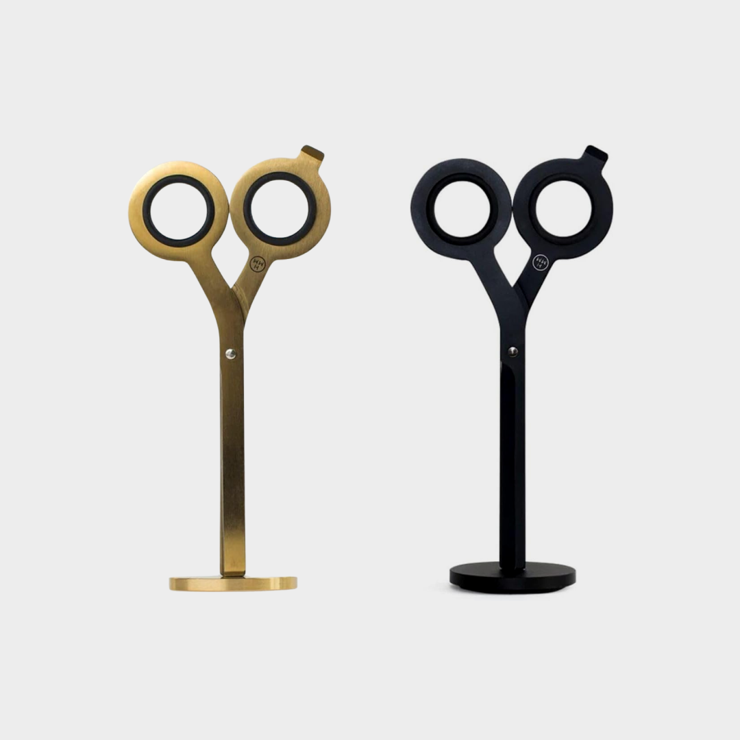
Your X-Acto blade has ghosted you after that 3am chipboard incident, and honestly? These scissors are the upgrade you deserve.
They're basically Le Corbusier's glasses reincarnated as cutting implements - modernist, minimal, and definitely judging your design choices. Sharp enough to slice through your design ego and precise enough to cut that presentation board you definitely didn't leave until the last minute.
Possible downsides? May cause spontaneous manifestos about the machine age while trimming paper.
It's 3 am in studio. Your body is 90% coffee and regret.
But wait - what if breakfast could validate your entire career choice?
Enter the Brick Waffle Maker: Because nothing says 'I made the right life decisions' like eating building materials for breakfast.
Your waffles are now load-bearing, properly coursed, and up to code. Le Corbusier would be proud. Louis Kahn is rolling over in his grave. Your little brother would be jealous.
Your mother might still wish you'd chosen med school.
Look, we know you haven't had plain water since 2019. You’ve evolved. But what if your water could keep up with that vibe?
Transforming your sad tap water into a premium hydration experience. Sleek, metallic, and wildly overpriced—because even your water should feel curated. Zaha would approve.
Bonus: The bubbles remind you of that time you actually had champagne, before you chose this career path.
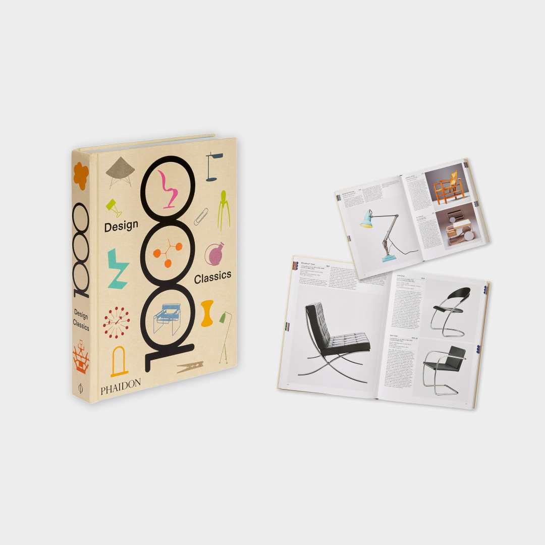
Ah yes, another 12-pound book to add to your collection of carefully curated coffee table statements.
Because nothing validates your over-priced design degree like a comprehensive tome of objects you can't afford, featuring chairs you'll never sit in and lamps that cost more than your rent.
Inside: 1000 reminders of that Eames lounger you'll totally buy someday when you're not paying off student loans. You'll mostly use it to prop up your monitor to achieve ergonomically correct posture while working on yet another bathroom renovation.
Designed with the same attention to human comfort as most developer-built condos (read: minimal), these are here to provide the emotional support your project manager can't.
Perfect for those days when you need a hug but will settle for warm feet and passive-aggressive messaging.
Sometimes, the only thing getting you through that four-hour zoning meeting is knowing your socks are silently screaming on your behalf under the conference table.
Ideal for architects who have replaced all normal human interaction with sardonic accessories. Still probably more supportive than your first internship.
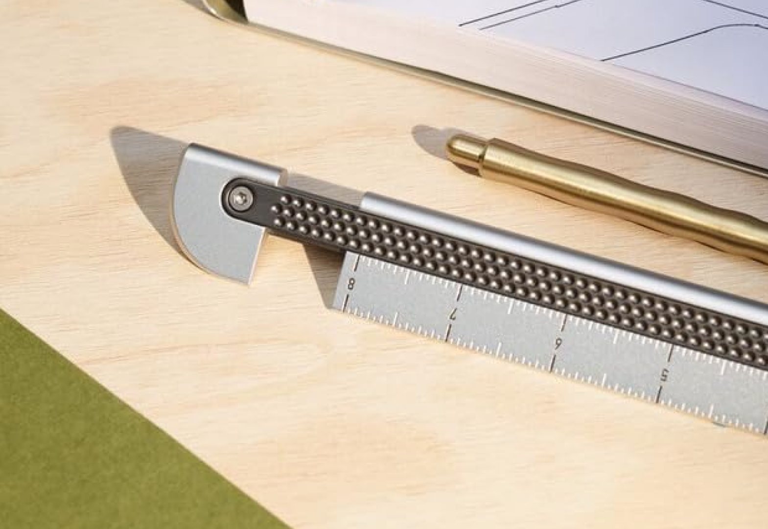
For when a regular ruler just isn't sending the right message about your commitment to overthinking simple measuring devices.
The Metrolog isn't just a ruler - it's a $98 statement about precision, a conversation piece about materiality, and a reminder that you once had disposable income.
Made from solid brass because somehow that makes measuring things feel more intentional.
Perfect for those moments when you need to measure your diminishing will to live in both metric AND imperial. You'll still end up eyeballing that sketch anyway.
Drinking coffee from a ‘black’ mug? Please—that’s for people who think Helvetica is ‘just a font.’ This isn’t black. It’s Pantone 419 C, thank you very much.
Perfect for your morning ritual of caffeine and quiet judgment, watching colleagues fail the warm vs. cool gray test as you sip in superiority.
Disclaimer: May cause uncontrollable urges to educate interns on the emotional impact of hue, tone, and shade. They’ll thank you later. Probably.
Finally, a piece of flair that says what your internal monologue screams during every coordination meeting.
Wear it to silently communicate with other architects across the room, or when your client asks for 'just one more quick revision.' Better yet, buy multiples - one for every time you've contemplated starting a goat farm instead of dealing with redlines.
All proceeds go towards sending us to the AIA convention, where we'll collectively pretend we're not all thinking about that goat farm.
Sometimes the only thing keeping you from a complete existential crisis is the ability to create perfectly aligned numbered lists.
In a world where your client's vision keeps 'evolving,' and your contractor's interpretation of the drawings is 'creative,' these modular number stamps offer the illusion that some things can still be ordered and controlled.
Perfect for organizing that ver-growing to-do list while you live at the office or numbering the reasons why you didn't become a dentist.
May cause compulsive need to stamp numbers on everything in sight just to feel something.
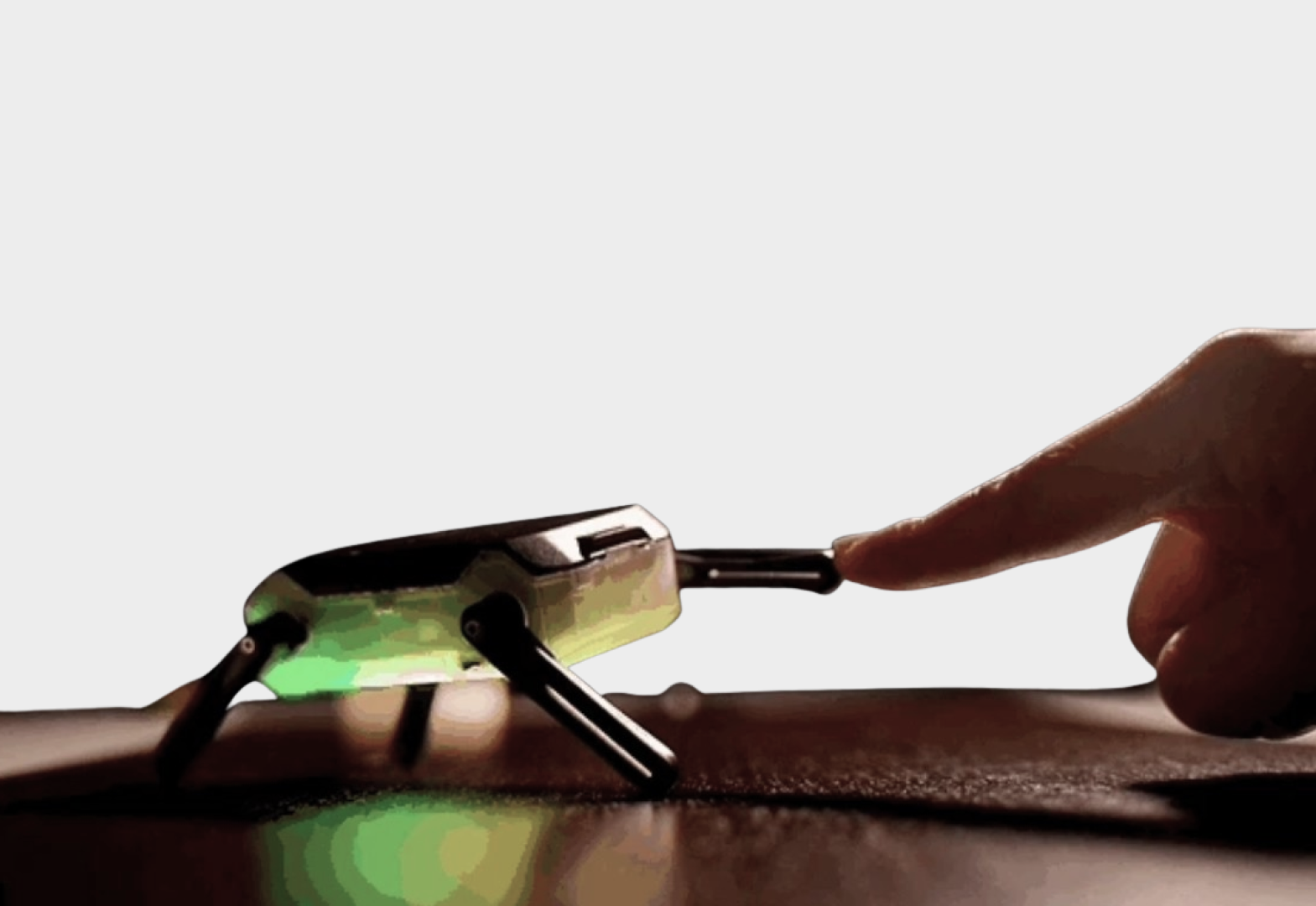
Meet your new emotional support robot, because even your therapy bot needs to look architecturally considered.
This Kungfu Turtle is what happens when someone designs a fidget toy with a master's degree - sleek, overengineered, and definitely more expensive than it needs to be.
Perfect for nervously playing with during client meetings while they explain why they 'just want to open up the space' or during those moments when you're questioning if seven years of architectural education was worth it.
Remember when you used to walk around with a tape measure like some kind of design peasant?
Upgrade to this pocket-sized laser tool and feel like you're living in the future we were promised.
Perfect for when you need to measure a room but your client is watching and you want to seem more tech-savvy than their nephew who 'knows SketchUp.'
Makes satisfying beeping noises that suggest you know what you're doing, even when you don't. Added benefit: The red dot provides hours of entertainment for the office cat who's been judging your design decisions anyway. Pro tip: Also works great for measuring the growing distance between you and your non-architect friends.
This pen holder costs more than your last plot, but somehow feels like a justified expense because it's made of walnut and your therapist said to 'invest in joy.
Perfect for displaying those Rotring pens you're too scared to actually use, arranged with the same obsessive attention to detail you wish your contractor had.
It's not just storage - it's a desktop sculpture that says 'I care about material honesty almost as much as I care about having a place to put my favorite 0.3mm mechanical pencil.'
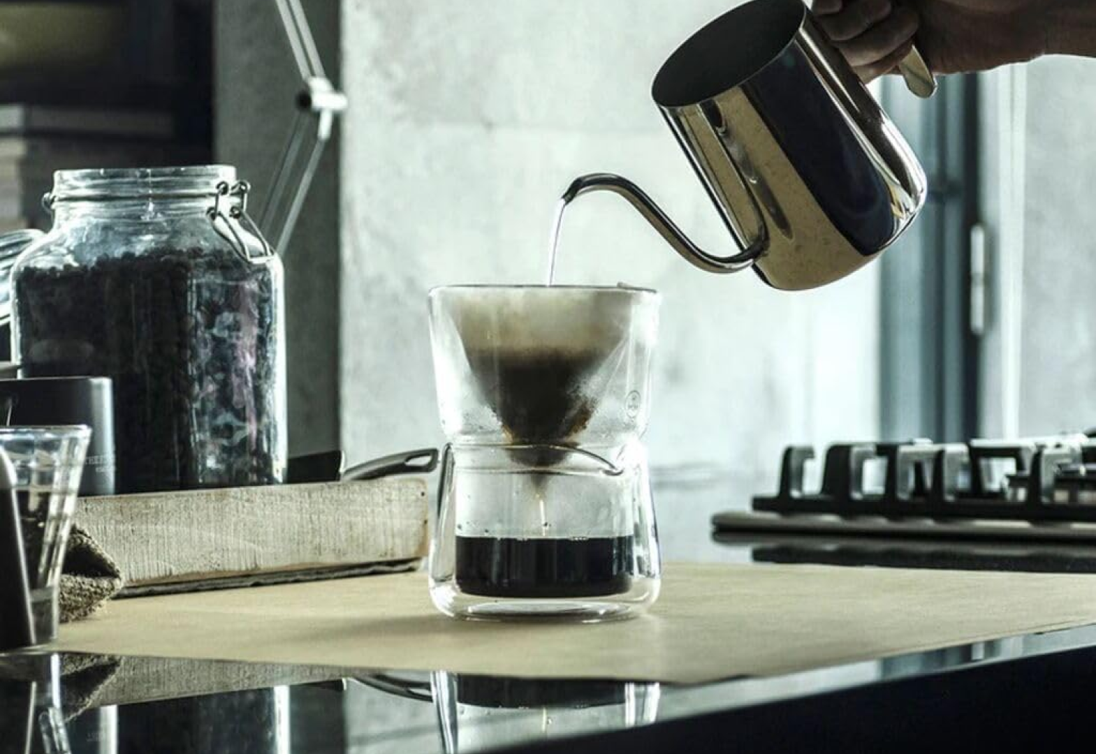
What if your caffeine addiction could make a statement about transparency and materiality?
This isn't just a pour-over setup - it's a morning ritual transformed into an architectural intervention, complete with clean lines and honest expression of materials that would make Mies proud.
Perfect for those moments when you need your coffee preparation to be as methodical and time-consuming as your design process.
Watch as hot water meets grounds in a performance of gravity and filtration that's more engaging than your last history lecture.
Remember food? That thing humans need to survive? These nesting cutting boards are like a well-organized architectural drawing set, but for your sad midnight meals between render cycles.
Finally, a prep system as meticulously layered as your Rhino files. Because even if you don't have time to cook real food, at least your cutting boards can demonstrate proper hierarchy and spatial efficiency.
Bonus: The nesting feature saves counter space in that tiny apartment you can barely afford despite your master's degree.
Finally, a pencil case that makes the same bold, reductive moves as your concept diagrams.
Enter this pencil case: one perfect pocket of zen-like simplicity, because sometimes even organization needs to be minimalist. It's basically Marie Kondo meets mechanical pencil storage.
No decisions about which pocket holds what - just one elegant void for all your drawing tools that cost more than your monthly food budget. Warning, it may cause an existential crisis about which pens spark joy.
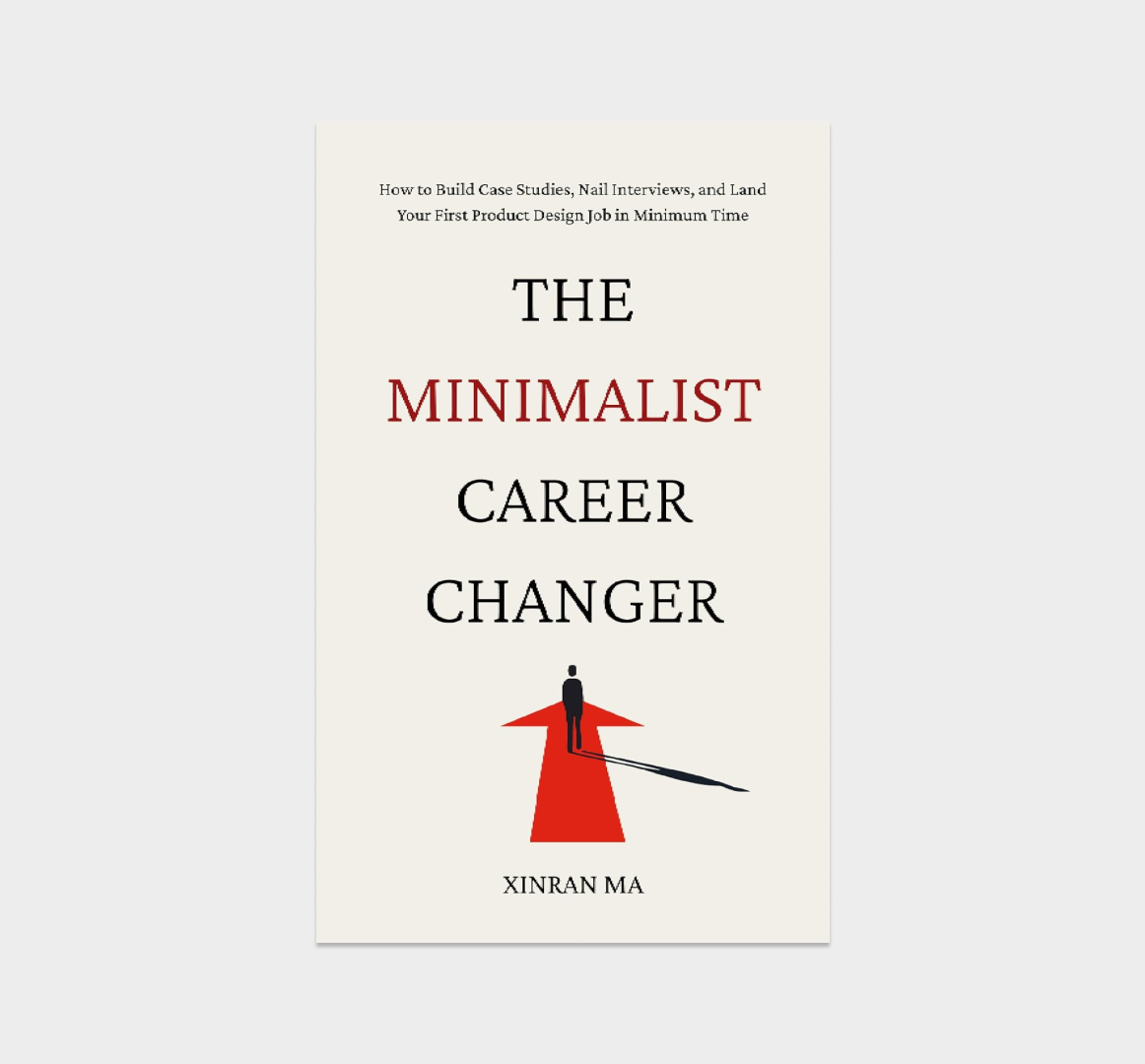
The book that whispers 'there's life beyond AutoCAD' when you're having your 3am crisis of faith.
Written by one of our own who made it to the other side, this is your guide to pivoting from 'designing buildings that never get built' to 'designing digital products that never get built, but with better work-life balance.'
Perfect for reading under your desk while pretending to work on yet another RCP. Contains fewer load-bearing walls and more user journeys, and actual hope for seeing daylight again. You'll still draw boxes, just on different software.
Because you haven't seen actual daylight since the semester began.
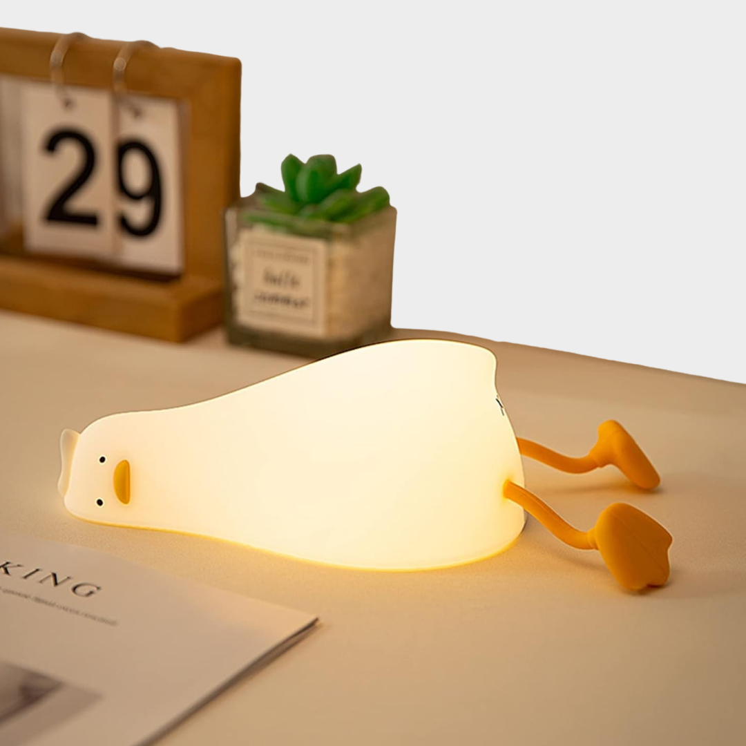
This isn't just a night light - it's an architectural rebellion against your studio's fluorescent prison, simulating that warm solar glow you vaguely remember from your pre-architecture life.
Minimal enough to look intentional, while desperately trying to trick your circadian rhythms into thinking you have a normal sleep schedule.
Finally, a chance to experience that 'natural daylighting' you keep hearing about.
These shakers are what happens when someone takes 'form follows function' way too seriously - and we're here for it.
Perfect for the architect who seasons their instant ramen with the same attention to detail as their wall sections.
Finally, a chance to practice your presentation skills while passing the salt: 'Note how the pure geometric forms create a dynamic dialogue with the negative space of your sad desk lunch.'
Even your dead plants deserve to be displayed in a piece that challenges traditional notions of vessel typology.
This magnetic vase boldly asks: 'Why should flowers be constrained by gravity when they can defy it?' Perfect for the architect who needs yet another way to prove they think differently than 'normal people.'
Place it in your home office to distract clients from timeline overruns, or use it in studio to make everyone question if they're hallucinating from sleep deprivation.
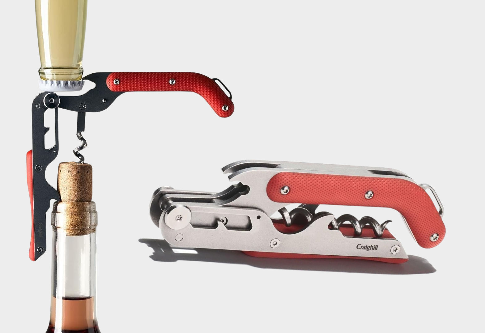
This isn't just a corkscrew - it's a precisely calibrated instrument of stress relief featuring a ratcheting mechanism that's arguably more sophisticated than your building's HVAC system.
Perfect for when you need to open that bottle of wine with the same mechanical advantage you wish you had in fee negotiations.
Finally, a tool that makes you feel like a sophisticated professional while slowly drinking away the pain of value engineering. Fun fact: Still easier to operate than most architects' websites.
We imagine a world where architecture students don’t need to shove their face into a padded egg thing to rest under the unrelenting fluorescent lights in studio.
We hope to live in it one day. But we don’t.
Till then. Ostrich Pillow.
Designers love mini things. Mini finger skateboards, mini sticks, mini bricks, mini existential breakdowns.
Give them what they really want this Christmas. Which is tiny scale construction materials.
And a sense of direction.
It’s like giving them a family heirloom.
Very aspirational.
And they’ll feel really impressive in the woodshop.
Amid all the snarky gift ideas, here’s a truly heartwarming one for anyone expecting a new little friend in their life. Perfect for those embracing their newest job title: parent.
This children’s book was lovingly created by a new dad who rediscovered his passion for drawing and illustration during parental leave.
Quick bonus drop!
Not trying to be too in-your-face, but here’s something worth mentioning:
Out of Architecture: The Value of Architects Beyond Traditional Practice (or audiobook) is well worth a solid read—packed with real stories and practical advice for anyone rethinking their path.
